INITWIN · Editorial
Software & digital strategy
The INITWIN logo explained: a symbol of a company built on innovation, clarity and digital growth
What the INITWIN triangular symbol communicates: structure, progress, technology and trust in custom software
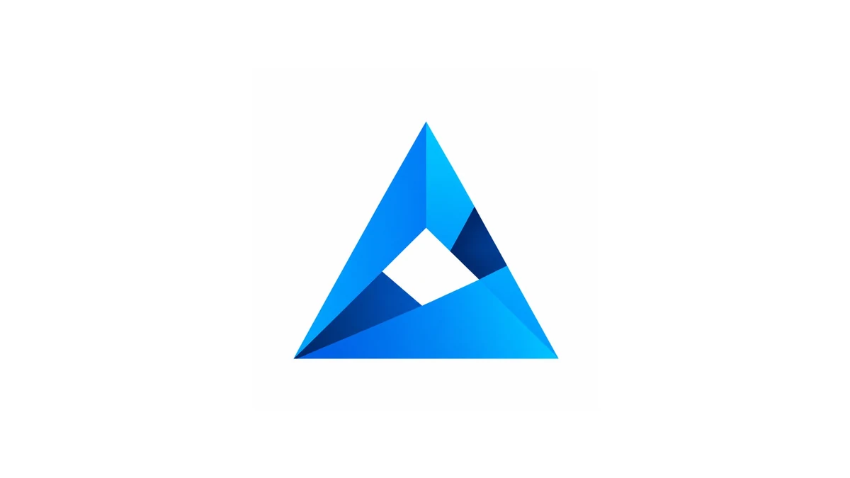
What the INITWIN triangular symbol communicates: structure, progress, technology and trust — visual identity for a custom software company.
A software company's logo is not just a graphic element. It is not just an image that appears on the website, business cards, presentations or marketing materials. A good logo becomes a concentrated form of the company's identity. Through shapes, colours and visual balance, it conveys what the company promises its clients: trust, competence, direction and value.
The INITWIN logo is built around a modern geometric symbol, formed by a stylised triangle composed of several surfaces in shades of blue. At first glance, the logo suggests an abstract letter "A", an ascending structure, an upward-pointing peak and a stable, clear, technological composition. It is a simple logo, but not banal. Minimalist, but with depth. Modern, but serious enough for a company that works with software solutions, IT consulting and digital projects for businesses.
The triangular shape: stability and progress
The main shape is triangular. The triangle is one of the most powerful visual forms in design. It suggests stability, direction, balance and progress. In INITWIN's case, the triangle is not static or rigid. It is composed of several interior planes that create an impression of construction, architecture and movement. This structure conveys very well the idea of a company that does not offer generic solutions, but builds adapted, modular and well-thought digital systems.
The upward-pointing peak is an important element. It can be interpreted as a sign of growth, ambition and development. For a software company, this ascending direction is fitting: clients are not looking only for an application, but for a tool that helps them evolve, reduce bottlenecks, automate processes and increase efficiency. The logo communicates this promise without using many words.
At a symbolic level, the shape recalls a solid construction. The three sides of the triangle can suggest three important pillars of a software company: analysis, development and support. Or, in another interpretation, they can represent the client, technology and business result. INITWIN thus positions itself not only as a code provider, but as a partner that connects the client's need with the technical solution and practical business impact.
Negative space: clarity and openness
Another important detail is the white space inside the shape. This negative space is not simply an empty area. It offers visual breathing room and creates a central point of interest. It can be interpreted as an opening, a portal, a window towards new solutions. In modern design, negative space is used to convey clarity and refinement. In this logo's case, it helps the symbol not appear heavy, but airy, intelligent and easy to recognise.
The interior space can also suggest the idea of a problem that needs to be solved. Around it, the technical structure is built, and the result is a coherent system. For a company that develops custom applications, this interpretation is very fitting. The client comes with a need, a challenge or a disorganised process, and INITWIN builds around that need a clear, stable and scalable solution.
Shades of blue: trust and innovation
The logo's colours are dominated by shades of blue. The choice is very inspired for a software company. Blue is associated with trust, technology, safety, professionalism and clarity. It is a colour frequently used in IT, finance, healthcare, legal and corporate fields precisely because it conveys seriousness and stability. At the same time, lighter shades of blue add energy, dynamism and a sense of innovation.
In the INITWIN logo, blue is not uniform. There are transitions between light blue, intense blue and navy. This variety creates a depth effect and suggests controlled complexity. It is as if the symbol were composed of several layers. This idea fits perfectly with custom software, where each application has multiple levels: interface, business logic, database, security, integrations, automation and reporting.
Lighter shades convey innovation, openness and accessibility. Darker shades convey safety, structure and seriousness. Together, they create a balance between creativity and rigour. This is an important message for a software company: it is not enough to be creative, you must also build robustly. It is not enough to have modern ideas, you must deliver stable systems.
Geometric precision and mature identity
The logo's geometric form conveys precision. Lines are clear, angles are well defined, and the composition has no unnecessary decorative elements. This suggests technical discipline, attention to detail and structured thinking. For clients looking for a software company, these qualities are essential. They want to know that their project will not be treated superficially, but will be analysed, designed and implemented methodically.
The logo does not use obvious symbols such as a computer, binary code, a gear or a cursor. This is a good choice. Many IT companies use visual clichés that quickly become generic. INITWIN, through this abstract symbol, has a more mature and memorable identity. It does not literally say "we make software", but more subtly suggests: we build, structure, optimise and raise the business to a higher level.
Another interesting aspect is the resemblance to a "mountain" or "peak" shape. This interpretation brings up the idea of goal, ascent and overcoming challenges. In a software project, the client often starts from a point where processes are unclear, manual or fragmented. The path to digitalisation can seem difficult. The logo suggests that there is a direction, a structure and a peak to reach.
INIT + WIN: from initiation to result
The name INITWIN can be interpreted as a combination of beginning and gain: "init" refers to initiation, startup, configuration, the start of a technological process, while "win" suggests result, success, advantage and gain. The logo supports this idea. The ascending form conveys that every project starts with a solid base and moves towards a result. It is a fitting symbol for a company that helps clients transform ideas into functional digital products.
Even without text, the symbol has personality. This is very important for branding. A good logo must work separately from the company name. The INITWIN symbol has this quality: it can be used as an icon, favicon, graphic element on promotional materials, mark on presentations, social media avatar or distinctive sign in an application interface. The shape is simple enough to be recognised quickly, but sophisticated enough not to appear banal.
Visual versatility
On a white background, the logo conveys clarity and professionalism. The contrast between blue and white is clean, modern and fitting for the technology field. The white background highlights the shape, and the absence of other elements allows the symbol to breathe. This version is ideal for the website, official documents, commercial presentations and digital materials.
On a dark background, the logo can take on a premium, more technological and powerful appearance. Blue shades can shine more intensely, suggesting digital solutions, infrastructure, data and innovation. Thus, the symbol has visual flexibility and can be adapted for multiple communication contexts.
From a brand message perspective, the INITWIN logo conveys four main ideas: structure, progress, technology and trust. Structure comes from clear geometry. Progress comes from the ascending form. Technology comes from blue, modernity and the faceted effect. Trust comes from the composition's balance and the triangle's stability.
A metaphor for software development
This combination is fitting for the target audience of a custom software company. Clients looking for custom applications are not looking only for beautiful design. They are looking for a partner who can understand processes, build architecture, integrate systems and deliver secure solutions. The logo communicates exactly this positioning: INITWIN is a modern but serious company; innovative but structured; creative but results-oriented.
The logo can also be seen as a metaphor for software development. Each interior surface is like a module of an application. Separately, each piece has its shape and role. Together, they form a coherent system. That is exactly how a well-built business application works: authentication, users, roles, data, dashboards, reports, notifications, integrations and security. Each module matters, but real value appears when they all work together.
The fact that the symbol is abstract makes it versatile. It can represent custom software, IT consulting, automation, digital transformation, web applications, cloud solutions, API integration, Business Intelligence or AI applied in business. It does not limit the company to a single service. On the contrary, it allows brand extension in multiple directions without the visual identity becoming inappropriate.
Memorability and B2B communication
At the same time, the logo has an aesthetic corporate enough for B2B clients. It is not playful, informal or overloaded. It is clear, technical and mature. This visual maturity is important when communicating with entrepreneurs, managers, clinics, transport companies, law firms, construction companies or organisations that need stable software.
Another advantage is memorability. Many IT logos use combinations of letters, brackets, code symbols or generic icons. The INITWIN logo has a distinct, easy-to-remember shape: a blue, faceted triangle with central space, pointing upward. This simplicity helps recognition. A client who sees the symbol several times can quickly associate it with the brand.
In marketing communication, the logo can be accompanied by messages such as:
- "Custom software built on clear processes";
- "We transform ideas into business applications";
- "Digitalisation with structure, security and results";
- "From idea to functional software product".
The logo can also serve as a starting point for an entire visual system. Triangles, diagonal lines, facets and blue shades can become graphic elements on the website, presentations, banners, commercial documents or interfaces. Thus, INITWIN's identity can become coherent not only through the logo, but through the entire visual language.
Conclusion
The INITWIN logo is a modern symbol, well oriented towards the technology field and fitting for a company that develops custom software. The triangular shape suggests stability and growth. The upward-pointing peak conveys progress. Interior facets communicate modularity and controlled complexity. The central white space brings clarity and openness. Blue shades convey trust, technology and professionalism.
It is a logo that can support a strong positioning: INITWIN is not just a company that writes code, but a partner that builds clear, scalable and results-oriented digital solutions. Through its form, the logo tells the story of a company that starts from an idea, builds structure and leads the client towards a better result.
In a market where many IT brands look similar, the INITWIN logo has the advantage of a clean, memorable and elegant identity. It is simple enough to work in any digital environment and expressive enough to convey the company's ambition: initiating intelligent projects and transforming them into real gain for the client.
Keep reading
- Why do my emails go to spam? Complete guide to SPF, DKIM, DMARC and server reputation
- How to build your own company email server with Mailcow, without monthly per-user subscriptions
- How to prepare your team for new software: training, adoption and resistance to change
- The 8-week MVP: how to launch a product idea without burning the budget
Need guidance on a similar project or a technical audit?